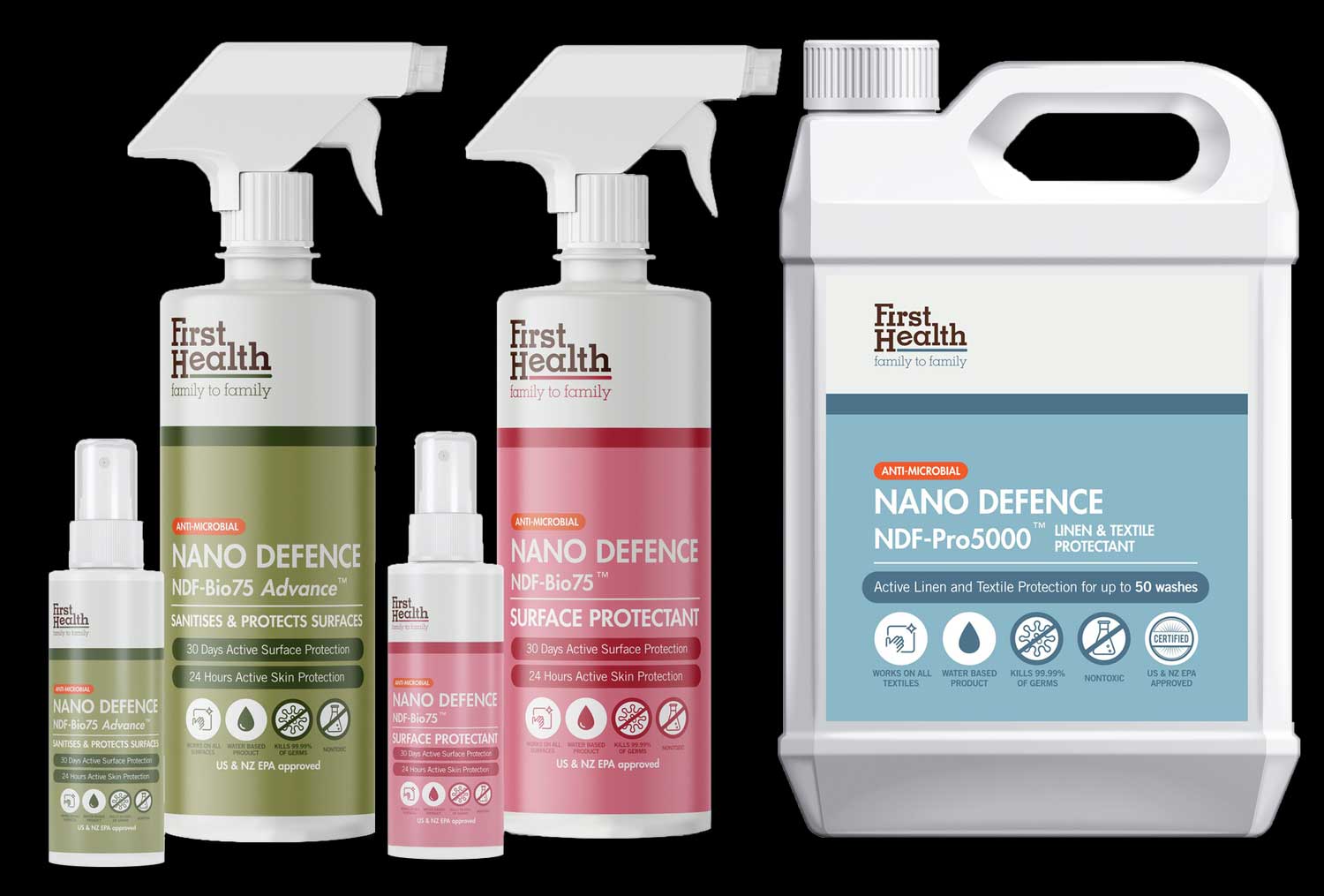
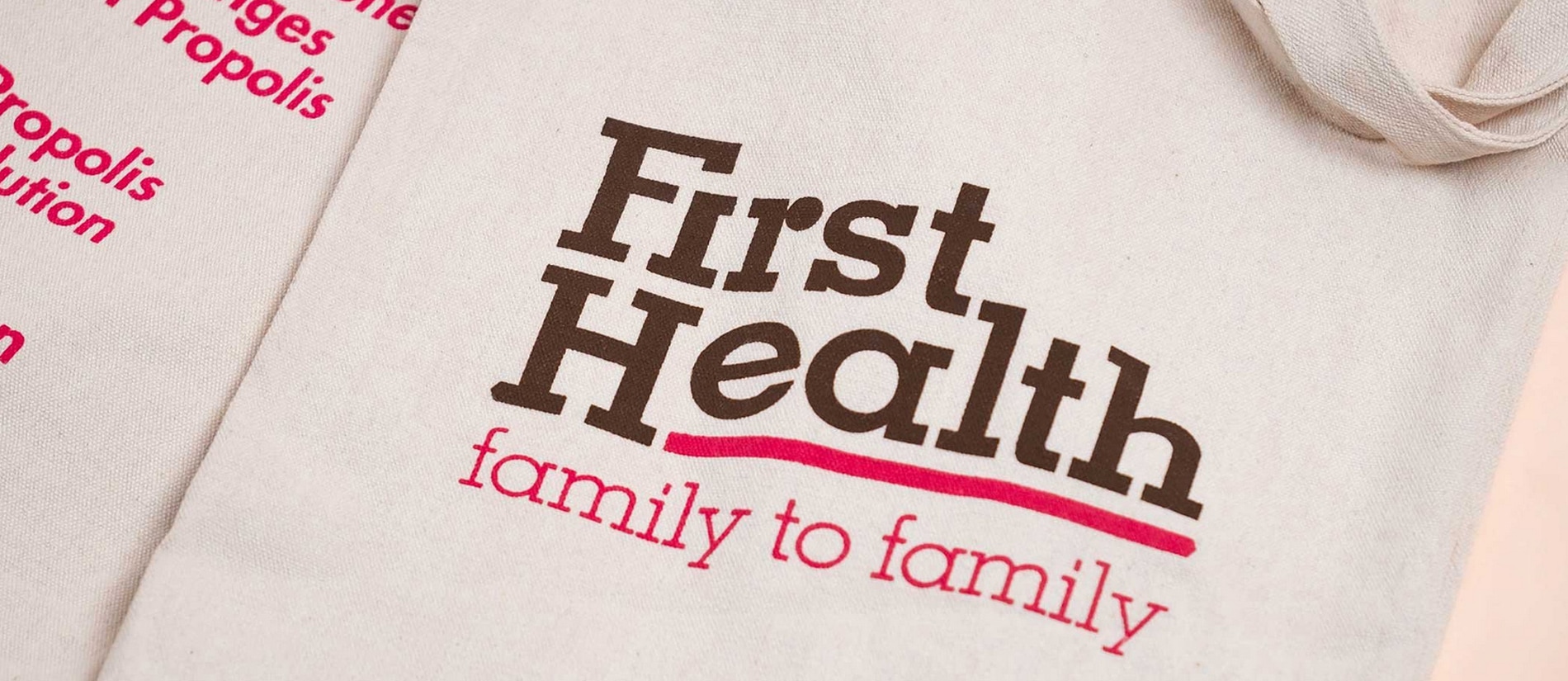
A multi-generational family business, First Health Singapore took the step of diversifying into lifestyle retail products. They consulted our help in redefining the brand identity while maintaining their commitment to health and wellness for every family.
Services:
Strategy & Positioning, Brand Identity, Logo, Graphic Design, Packaging Design, Website Design (E-commerce)
Industry:
Food & Beverage, Retail & Lifestyle (E-commerce)
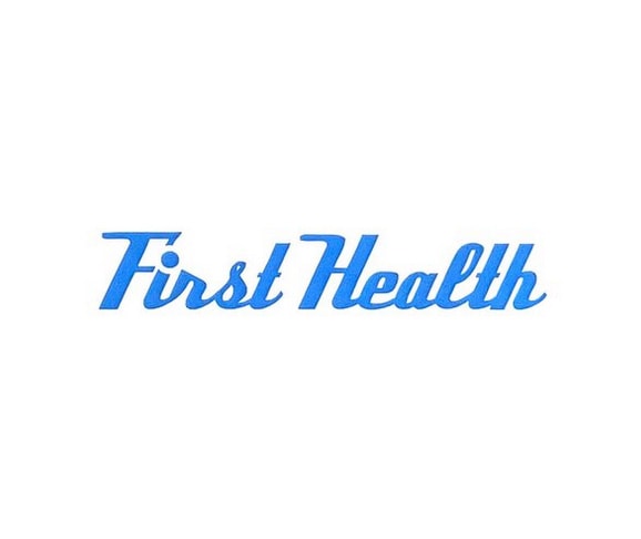
Before
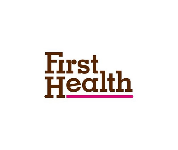
After
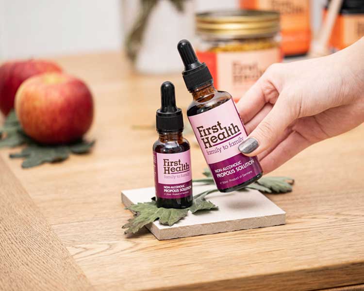
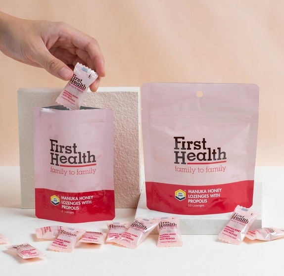
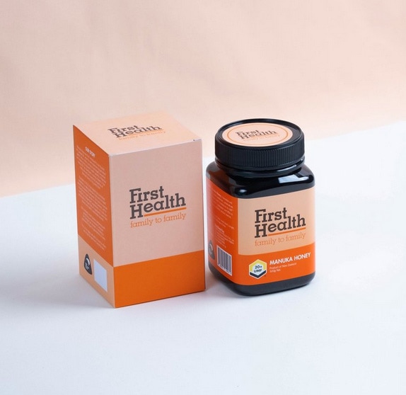
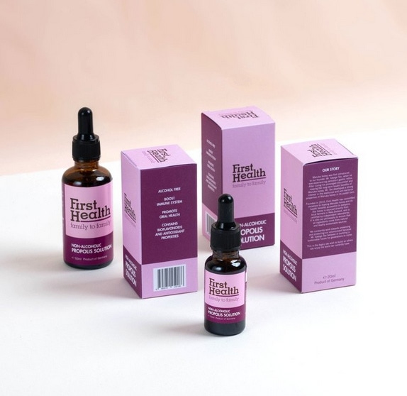
The project included a logo retouch, product packaging, e-commerce website design, and a mobile cart for roadshows.
The previous logo was active for more than five years. With plans to expand their product range beyond Manuka products, the logo we created had to be flexible to anticipate its application to other lifestyle and wellness products.
The brand tagline, family to family, was incorporated into the logo to establish First Health’s promise of being a family-centric business that provides healthier lifestyle options to other families.
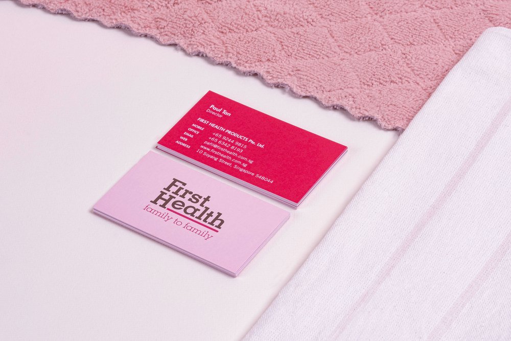
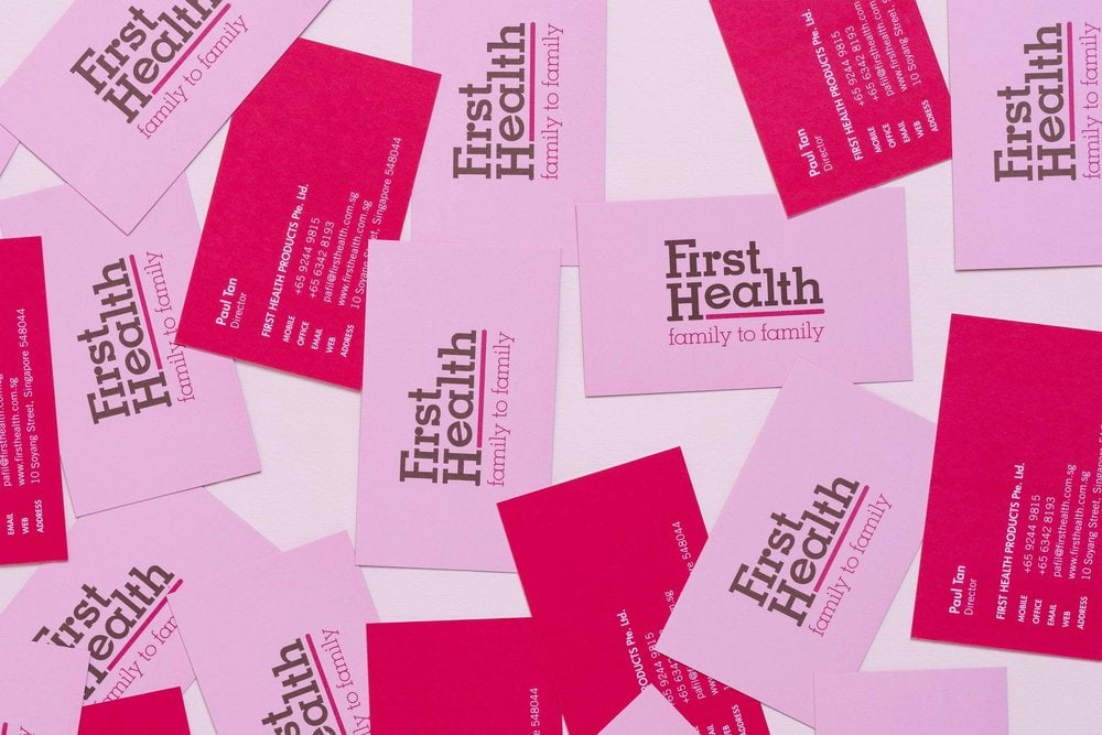
Selecting magenta as the primary brand colour communicates the brand vision and ethos of being ‘In The Pink of Health’ that is chic and engaging.
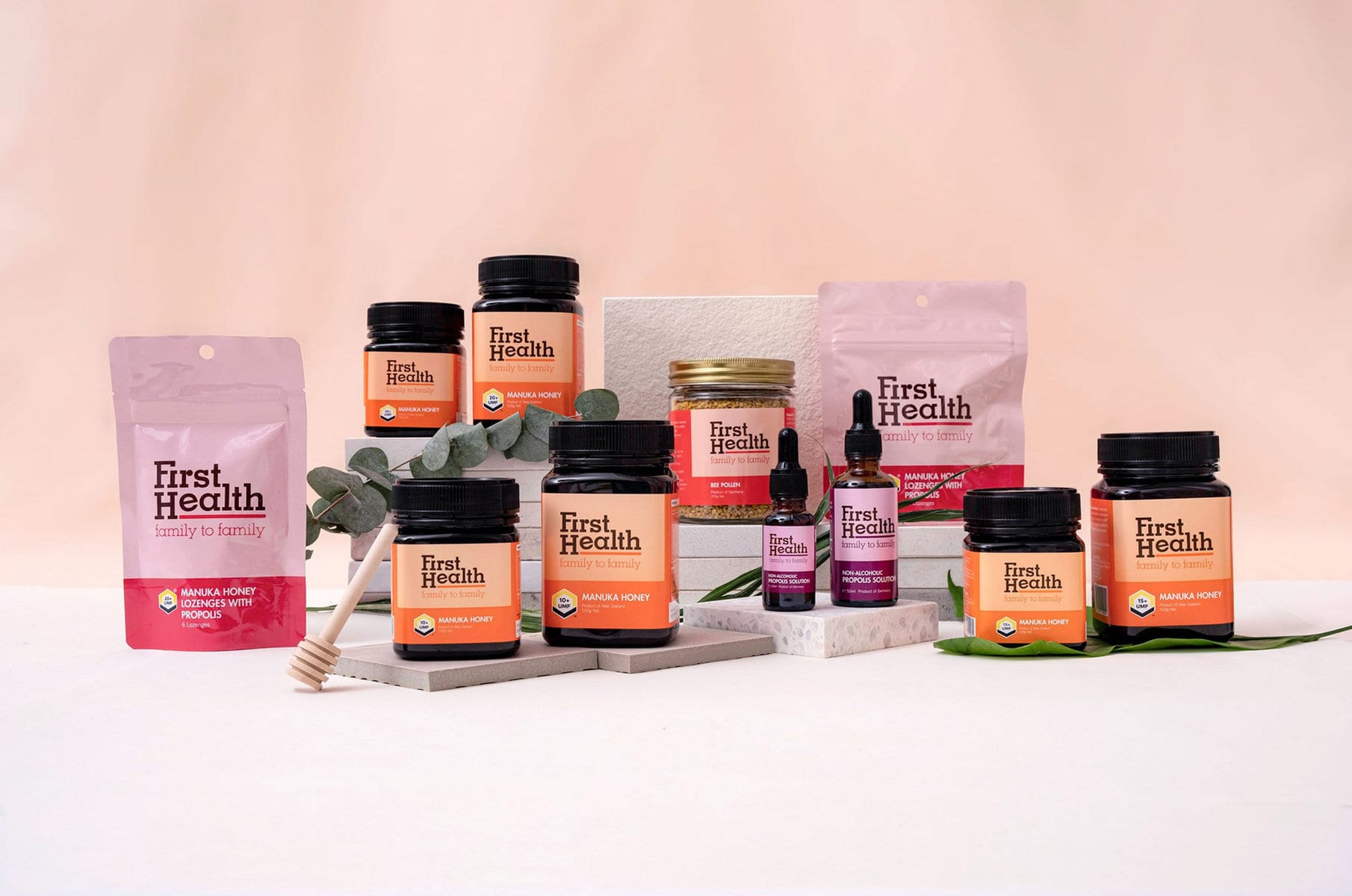
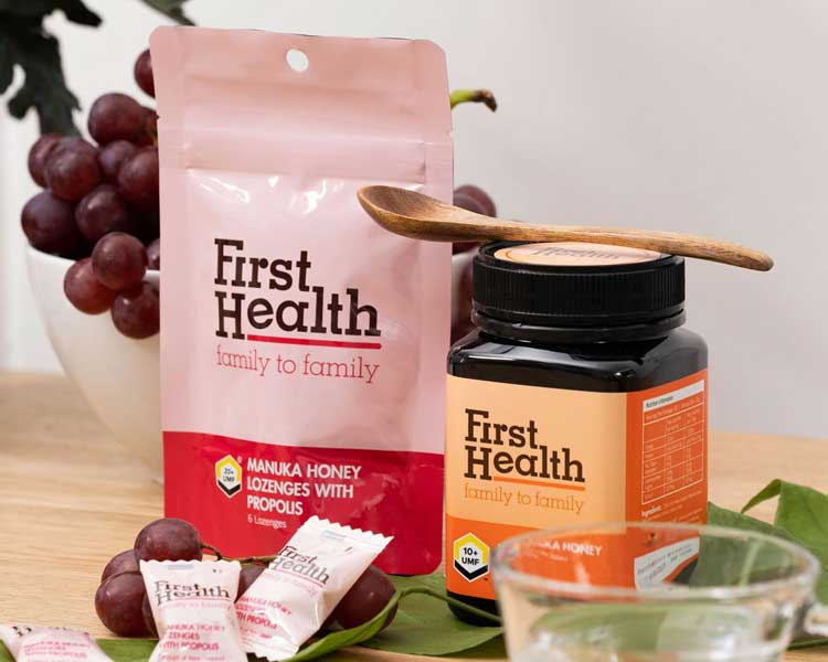
First Health has since been able to reach out to existing and new clients with improved brand perception and credibility. They have since expanded with their Nano Defence™ line of surface protectants.
