The Land Managers is a boutique real estate investment firm. They required a brand identity that exudes professionalism to stand out within the highly-competitive property development industry.
Services:
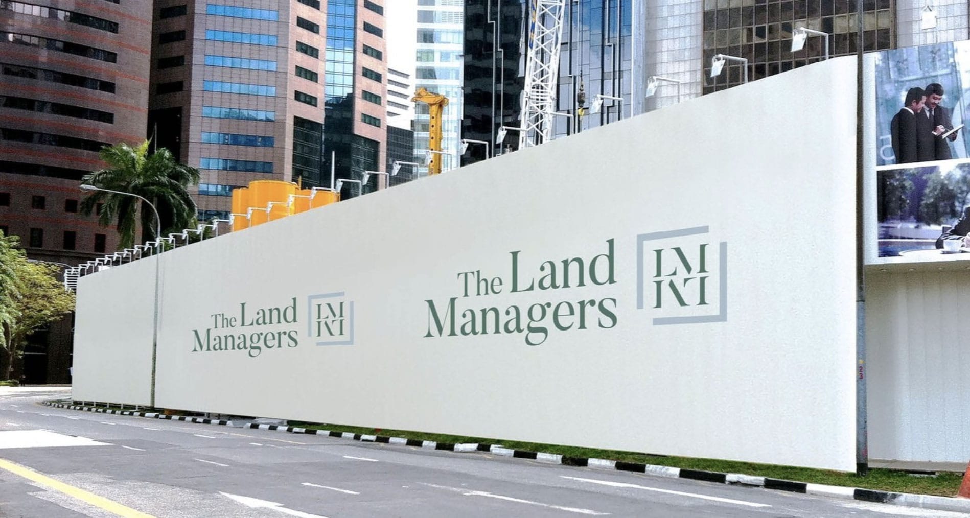
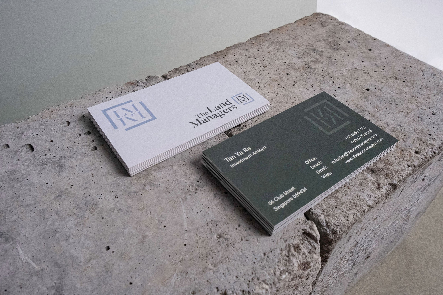
Strategy & Positioning, Brand Identity, Logo, Hoarding, Brand Stationery, Website Design
Industry:
Real Estate


The Land Managers’ current headquarters on 65 Club Street is also their first acquisition. As founder Andy Lim wished to weave this milestone into the brand identity, we picked on the blue and green colours of the shophouse’s facade and translated them into the brand colours. The cool grey corresponds to the brand’s calm and refined approach, while the earthy green represents their groundedness and sincerity.
The right angles that frame the initials ‘LM’ in the logo are cornerstones symbolising The Land Managers’ resolution to establish a good foundation that sets the opportunity for growth. The mirrored initials also signify the growth-orientated values of the brand, where the gaps between the cornerstones hint toward an upwards maturation.


The new brand identity has been well-received by The Land Managers’ team. They feel it aligns with the brand’s vision, setting the right tone for the company’s formal launch.

