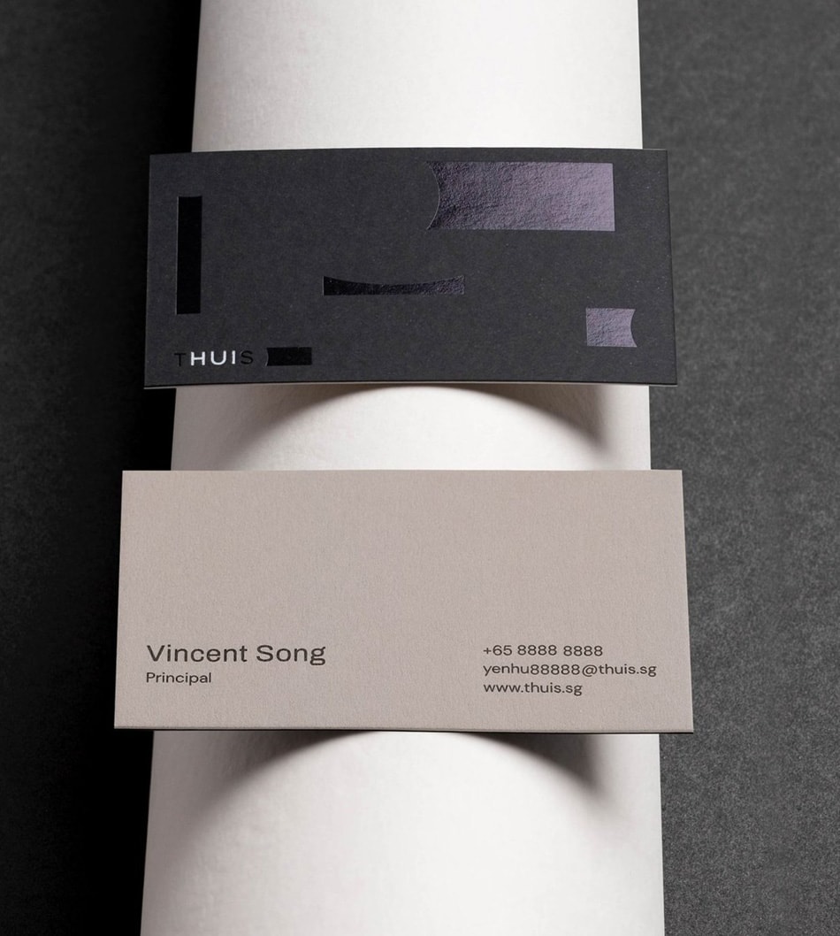
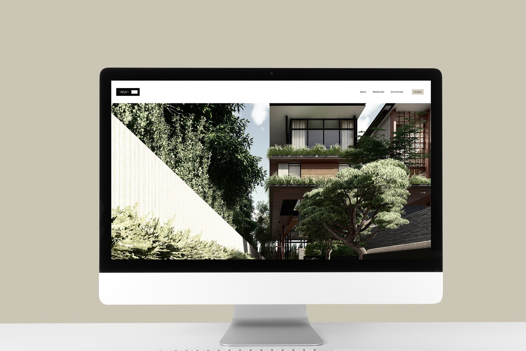
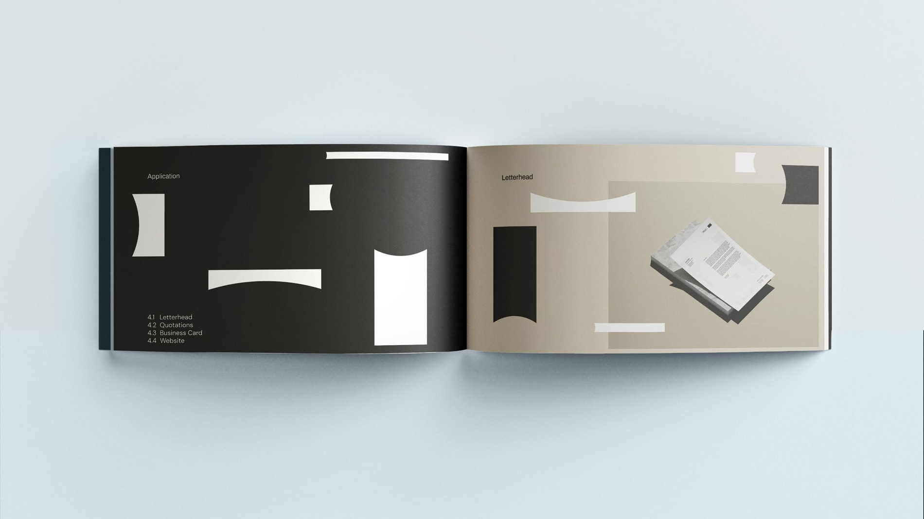
An architectural practice that cares about elevating one’s quality of living through a design ethos of deriving strong ideas from diligent study of scenarios and portfolios.
Services:
Logo Design, Brand Naming, Brand Stationery, Website Design
Industry:
Architecture
THUIS is an abbreviation of The Hui Studio and is a Dutch word that denotes being at home.
This multi-layered aspect of the brand name carries the brand’s vision of seeking and striking symmetry between contrasting mediums. Be it a residential or commercial project, The Hui Studio strives to make a space relatable and comfortable for its user – an extension of thuis.
Naturally, we translated this underlying purpose within other aspects of the branding project, where avenues opened for a more meaningful and synthesised visual brand identity.
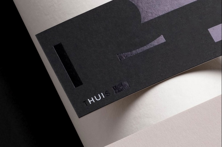
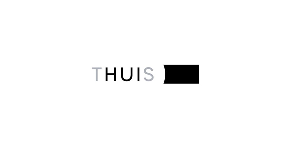
The logo balances typography with a clean graphic element.
Just as an architect thoughtfully weighs the balance between many binaries, the logo plays on positive and negative space to portray this dynamism. While the graphic element (a rectangular block with a concave edge) holds a tangible presence, it also carves a circle of negative space that envelopes ‘THUIS’.
The creative decision of three monochromatic colours in the logo is another level of binary thinking, where it has a functional and design-led purpose. It distinguishes ‘HUI’ from ‘THUIS’ and lends more visual appeal to the logo.
